2012年4月23日星期一

Graphic design 2_Guide To Life Book


  I did a lot of research and sketch, finally i chosen Away from the pressure as my theme.


  I think most people have seen Journey to the West. When the Monkey King was under pressure in the mountain, his master to save him, tore off the seal of his that symbol. I put on my cover,  the mountain represents pressure, the Monkey King represents have  pressure's people. Means that if you do not have master, want to leave this pressure of the mountain please look this book.


  In life we will have many problems when these problems bothering you. You need to find and solve problems.
  The first picture means the problems pressing people can not breath. The second picture means the pressure represents nail, a hammer  represents need to solve the problem.


  More reasonable use of time.
  In some people's eyes, only three things, work, eat, sleep. Some people they know how to use of time to work, sport, make friends, go to the party. The same work some people can make reasonable use of time to do other things.


Appropriate sports can to help relieve the pressure.


  A good sleep, but not excessive. When someone feel pressure, someone insomnia, and someone to sleep to pass the time.


  Change the way of speaking.
  When you feel pressure to speak easily hurt other people, this way only add the pressure you need to change speak by a warm way. 


  Eat on time and do not eat too much.
  In order to relieve pressure, and some people eat too much, some people do not eat or drink. These two way only increase the pressure of the people.


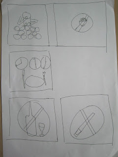
  The right amount of smoking, the right amount of drinking. 
  Drink, hindering the ability to solve problems. Smoke,  does not help to solve the problem , and  no good  for health.


  Amount of sports. Find more relieve the pressure of outdoors sports.


  Get more help from friends.
  When with a lot of people thinking a one problem, the problem will be simple. So I design a lot of people but they have a one head.


  The way of the relaxation.
  I design this like an open book. Books inside have a lot of knowledge, knowledge means ocean, swimming in the ocean, get rid of pressure. 


Illustration 2_CD Cover

Sketch:


First i used marker to drew.


I used watercolor pencils to drew, and used a brush to brush the water on the picture. Because when use watercolor pencils to draw, and then brush the water   it is look like water color but is not strong than water color.I like use watercolor pencils.


My theme is colorful dream. I want explains wonderful life. This painting gives the impression that colorful, means colorful life.The painting i drew very detailed and looks very digital, because I really like electronic music.

Illustration 2_News Illustration


I need copy this picture and scan.


I used watercolor to drew.  I do not have to draw people look very detail, the shadow can be.


I used AI complete this look like newspaper.

Illustration 2_Bad Taste


I did mind map for i can get more ideas.
Finally i chosen KFC to be my theme. Because  KFC has lots of fried food, not well for health, so I chose Kentucky as my theme.

Sketch:


KFC belongs to the fried foods, contains carcinogens,eat lots of KFC food will make the body's PH value fall to 6.8, is the cancer cell proliferation fastest time, with some reports said, all 100% of cancer is the acidity system.


The fat content of fried foods don't digest, eat fried will indigestion, even nausea, vomiting, diarrhea, loss of appetite. Often eat fried foods, lack of vitamins and water, easy to get angry, constipation.


I combine all of my idea to complete the painting. The represent of KFC's the older man face. KFC biggest disadvantage is to fat. Why the painting of chicken has four legs.?Because chicken too fat can not support its body, so I drew a four-legged, want to tell people eat too much KFC will lead to fat.

Visual communication media with cultural meaning_The Three Posters

  I chose the food culture, because the diet is an indispensable part of life. I choose rice  as the theme of my poster, because I see a lot of waste, so I want to do this poster to tell people that rice is very important in our life.

  I chose the diet combined with music, because diet represents a material life, music is the spiritual life,and the lives of the people is the two-part, so I use the different countries the famous food combine with their representatives instrument together, reflecting the life of a country.

  My poster's title is love food like love music, i used different countries language.


Poster 1: Sushi in Japan


I chosen represents instrument is sanxian, and represents food is sushi, so I drew sushi as part of the instrument. The Sushi color would look like the Japanese flag.


Poster 2: Bibimbap in Korea


  I chose the represents instrument is the janggu, and represents food is a bibimbap, so I drew stone pot like drum. Drew bibimbap inside the vegetables like vegetable men beat a drum.
`

Poster 3: Pulut Panggang in Malaysia


 I chose the represents instrument is the gambang, and represents food is a Pulut Panggang. It looks like gambang on the keys, so I put them together.


2012年4月21日星期六

Graphic Design 2_The Adoption Character


About CHACHA
Name: CHACHA
Gender: Male
Age: 8
Weight: 950g
Height: 4.2cm
Race: Dai
Favourite thing: Dance
Favourite colour: Pink, bule and yellow


The story:
Cha Cha is a happy talented baby elephant.He likes to dance to see everyone's laughter. He has joined the world's most famous circus, and gained a lot of mirth. Cha Cha has decided to spread his joyfulness to people. Adopt Cha Cha and let him bring happiness to your world.


Sketches:


I drew a lot of different elephant about my CHACHA.


Finally i choose this one.


Sketch using pencil. So he is an elephant with big head and small body. Color setting; Use Illustrator to start color.

I used pink color makes he look more cute, because he is a happy elephant. He has blue and yellow clothes, head-wear. The Dai’s people like bright colors, so I painted blue and yellow elephant's clothes with head-wear. The blue represents the blue sky, the meaning of freedom. The yellow symbolizes the harvest. The circle pattern on the clothes represent good luck.


Modelling:


The final modelling:
I used Hobby Clay to do, will harden the moment it dried. The final modelling of body and ball.


When i finish the model, i got a big problem. the elephant can not stand. So I did a like stage things, put the ball into it, make elephant can stand.

Coloring:


The process of colouring. Frist i used water to do. Three hours later, I found the water color did not dry. until the next day water color did not dry. So I asked my fridents what color they are used. Than I decided do it again. I washed off with water-color, and i used “Pelaka” to colour it.


In order to paint quickly dried with a hair dryer. I have to brush it for many times.


In order to make the elephant look more cute, I added two feathers to his cap.


See!!!


See my CHACHA can stand.

Packaging


I drew some sketch for my packaging.

I done this and print out that size not very well can not see chacha’s head only body.


I change packaging’s sizeand color. Look better than before.


Will you adopt him?